About
If you're familiar with Income Defense, skip to the next paragraph. On the surface, Income Defense plays like your typical tower defense. You build bunkers and get upgrades to kill the units that ...
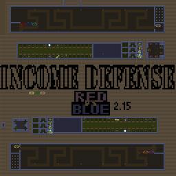
If you're familiar with Income Defense, skip to the next paragraph. On the surface, Income Defense plays like your typical tower defense. You build bunkers and get upgrades to kill the units that come at you. The twist? Units aren't selected by the computer, they're sent by the opposing team, and sending units increases how much money you make every cycle of the timer.
If you're familiar with Income Defense Red vs Blue (up to 2.0), skip to the next paragraph. What makes Red vs Blue stand apart from other Income Defense maps? It's so far the only one that has multiple stages of bunkers; now instead of hitting the bunker maximum around the same time you get your first upgrade (if balancing defense well) you'll probably have more than 150 upgrades before you max (20 stage 4) Red vs Blue bunkers. And don't worry, with far more powerful units to send, you can still push your opponents' defenses to their limits (and they yours); the final unit in RvB costs (relatively) 50 times that of the typical final unit of other Income Defenses. Again, don't worry, the ratio of income gained from pricier units drops very slowly (until the sudden drop at the $5M unit). Also, players can buy lives (whose prices double with each purchase, starting at $1k and depleting at $20M [each player's prices unaffected by others']) and build bunkers quickly with a bunker guy (representing what's going in the next bunker) who's cloaked by a nearby arbiter (so allies can see the player's upgrades but opponents can't). And there's a vote-based banning system. But what's going on with ID:RvB lately?
There are three players per team again. Twenty bunkers at a time per player. Rebalanced units and upgrades to compensate for less bunkers in the hands of one defender. Sent units retain the sender's color. Since 2.2 is still a long way coming as I once again had to strip some features and am in the middle of making them from scratch again, I'm releasing 2.15 which is basically 2.1 but without tutorial, no subbing (still ob), and no known glitches.
Reviews (Submit a Review)
Log in and reach level 3 to submit a review for this map.
Related
Meta
- Map Style:
- Custom (UMS)
- Categories:
- Defense (Competitive) Defense (Team)
- Author:
- NightChime 4
- Filename:
- Income Def Red vs Blue 2.15.scx
- Latest Version:
- Income Def Red vs. Blue 2.15
- Type:
- StarCraft Map
- Size:
- 93.4 KB
- Overall Rating:
-
5 / 5 (2 votes, ranked #339) - Tags:
- competitive, income, multiplayer, teams, ums
- Players:
- 6
- Teams:
- 2
- Tileset:
- Jungle
- Dimensions:
- 128x128
- Favorites:
- 0
- Downloads (Total):
- 5,471
- Downloads (Daily):
- 0 (ranked #13,146)
- Submitted By:
- NightChime 4
- Discovered On:
- Oct. 15, 2010
Share Map
- JavaScript Widget:
-
Income Def Red vs. Blue 2.15
Income Def Red vs Blue 2.15.scx (93.4 KB)
- Released:
- Oct. 15, 2010
- Downloads:
- 1,433
- Direct Link:
Rating
- Opinion:
2 votes considered -
- Neutral
Neutral
Your Rating
If you were logged in you could rate this.
Achievements
No badges or achievements yet.
We Also Recommend
If you enjoyed this map.
 |
Auction Defense |
 |
Ind. Random Def [Hero] 1.15.scx |
 |
April Defense v2.001 |
 |
Line Tower Wars II (v 2.00).scx |
 |
Line Tower Wars |
User Comments
Support Nibbits by linking to us:


i really like this version of income d!! :]
the only criticism i can throw at you is the disappearing bunks and the limited amount of bunks.
keep up the good work night :D
174.34.9.xxx
174.34.9.xxx
Football Manager 2008 The most realistic and critically acclaimed football management simulation is back, fully updated with over 100 new features. <a href="http://www.dropshippers.co.za/">Gage Inventory</a>
184.72.242.xxx
yay INCOME D
Yes this map may seem weird if you dont know what you're doing...
The differences are listed on the project's main page. If that's not what you meant, I might suggest being a little clearer. :)
i still dont get wat the difference between this 1 and the other ver
My apologies, but the older "4.5" had a pretty bad bug, this one is totally clean (kept the same name due to minimal circulation).
By the way, I'm really not trying to flood the "recent maps", I'm just organizing my projects. If I could remove old stuff I would, and same for if I could take it off the "recent maps" list.
Ive still got beef with this one. Two big mistakes and this isn't opinion either. See ya online and well talk more.
75.25.172.xxx